Nature’s Healing Prescription:
Designing the PaRx App to Empower Users to Connect with Nature
Please note, this case study is a student project and is not associated with PaRx.
The Big Picture
The Context
“PaRx” is a nature prescription program that encourages healthcare professionals to prescribe nature time to patients as an evidence-based tool to improve their health. My interest in designing a PaRx app stemmed from my belief that this grassroots-driven initiative has the potential to positively influence many people’s health and wellbeing.
The Problem
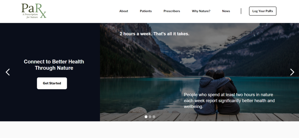
Although the PaRx website provides helpful resources, the program could potentially achieve greater impact and success if it offered more easily accessible and in-the-moment resources and support for individuals looking to achieve their nature goals.
The Solution
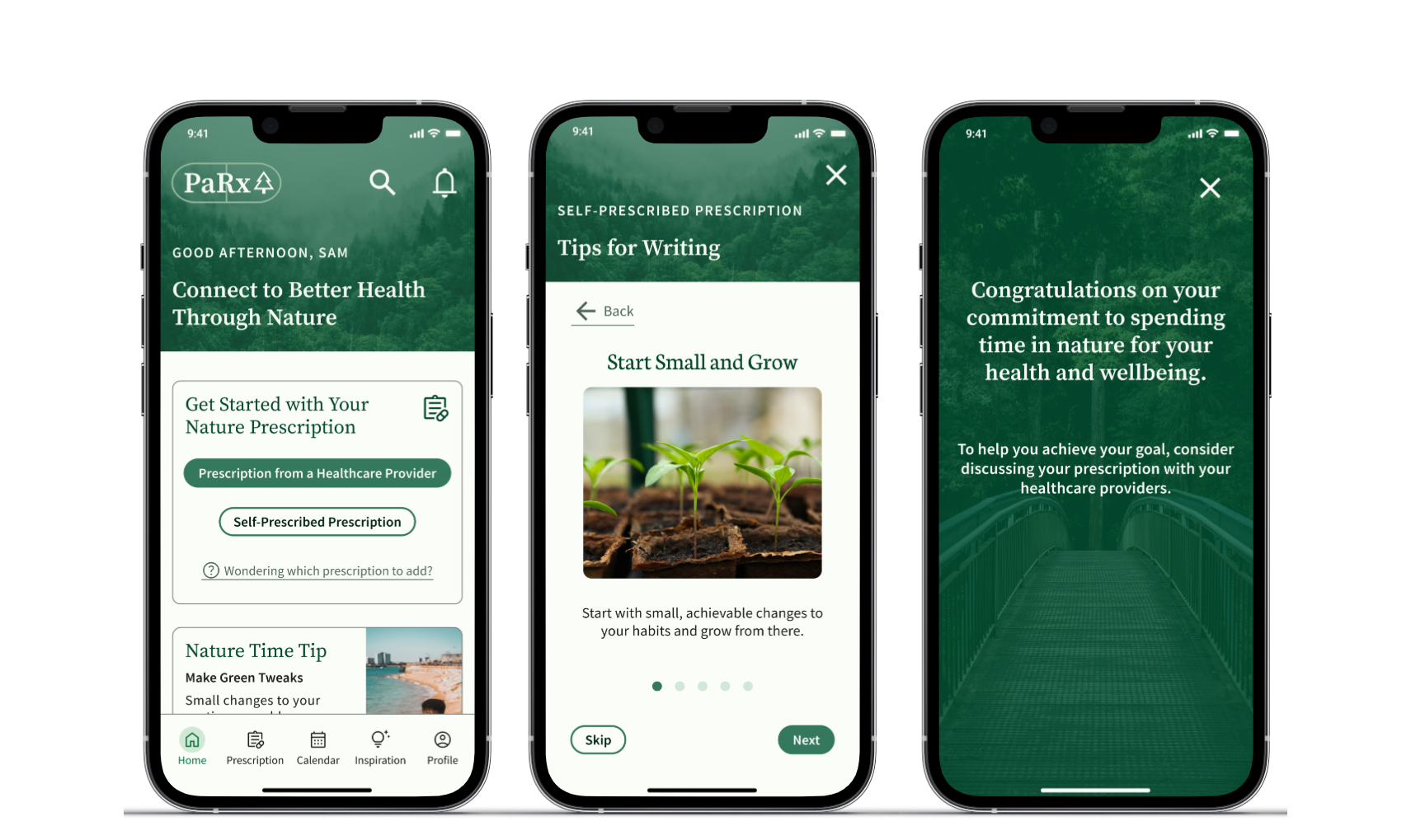
The PaRx app is designed to equip users with the tools and support they need to achieve their nature connection goals. With a personalized, direct-to-consumer approach, the app facilitates improved access to both nature and the PaRx program, and empowers users to take control of their health and wellbeing by creating their own nature prescriptions.
The Story Behind the Solution
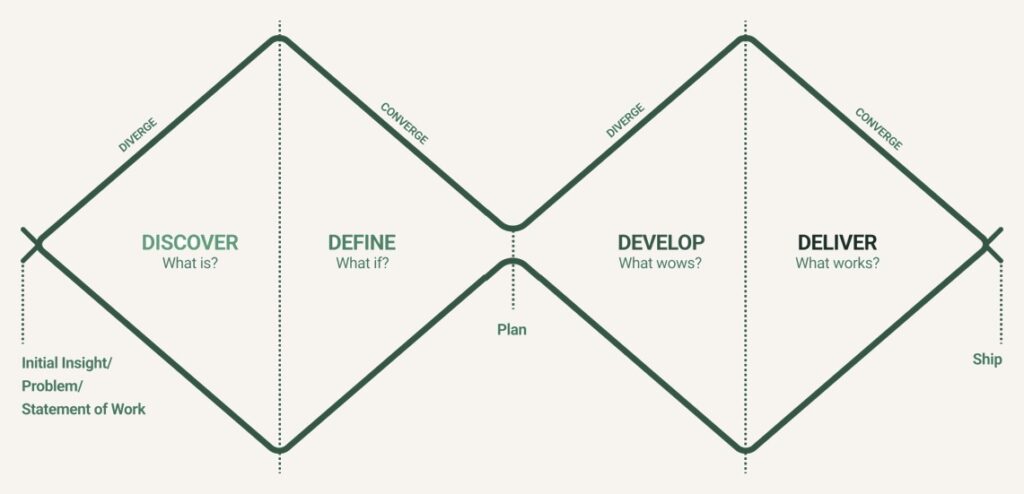
I followed a double diamond process to provide a framework and structure for the development of the app design.
Empathizing and Understanding
I took a qualitative approach to my research because I wanted to look for patterns in the data that would guide my design. Considering my methods, I wanted to understand the perspectives of the stakeholder, potential app users, and current PaRx users, and compare to other nature prescription programs. I therefore completed the following:
Looking for Patterns
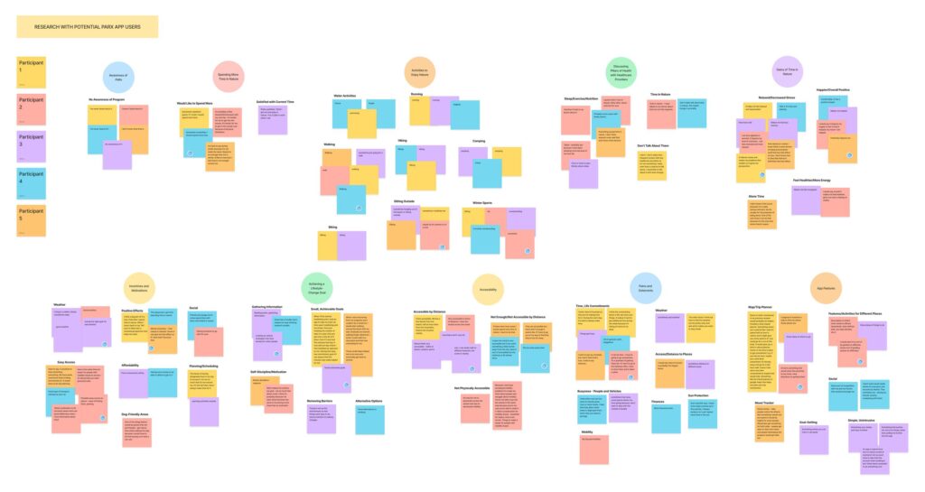
Applying affinity mapping and dot prioritization (as shown for my user interviews), I evaluated the data to start identifying patterns and common themes that connected ideas.
Getting to the Root of the Problem: Key Insights
From my affinity maps, I determined three key insights that guided a holistic design:
Direct to Consumer Model is Called For
Time and Life Commitments are the Biggest Barrier
Increased Access to Nature is Needed in Different Forms
Mapping Out a Solution
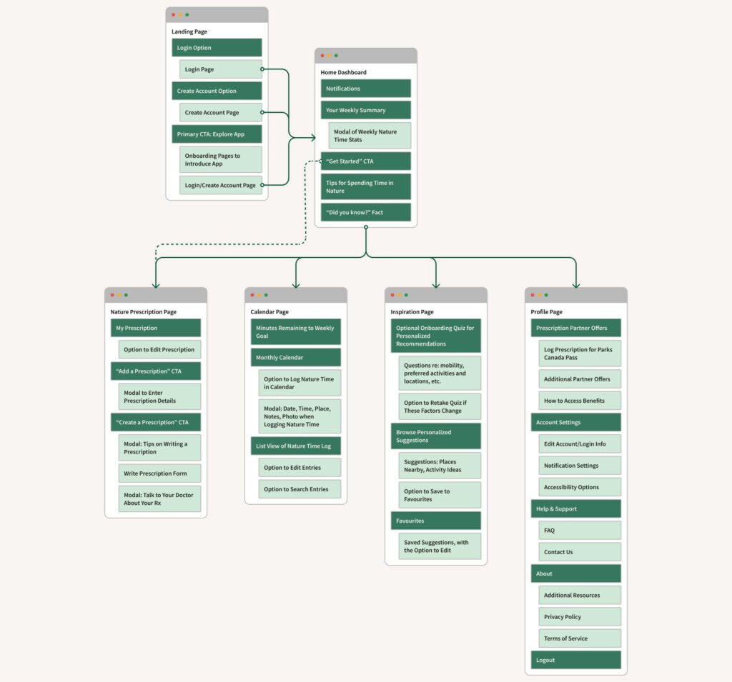
Applying my key insights from my research, I created a site map of the app, which I iterated on throughout the design process to finalize the overall content and structure of the app.
Creating a Prescription from Start to Finish
I chose creating a prescription as the primary task to focus on, as this would be a core feature of the app and a unique change to the existing PaRx program. For this task, I made an accompanying user flow to determine the steps involved and needed screens.
Wireframing the User Flow
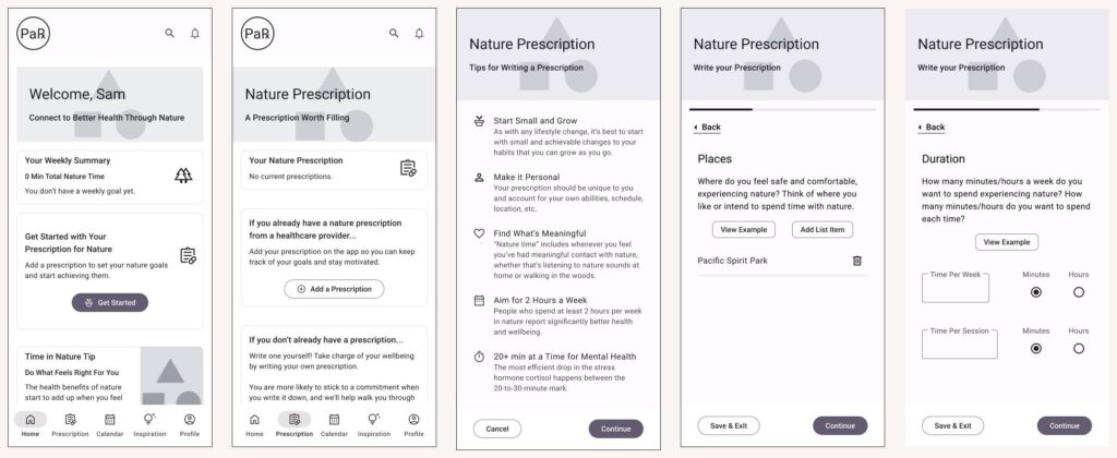
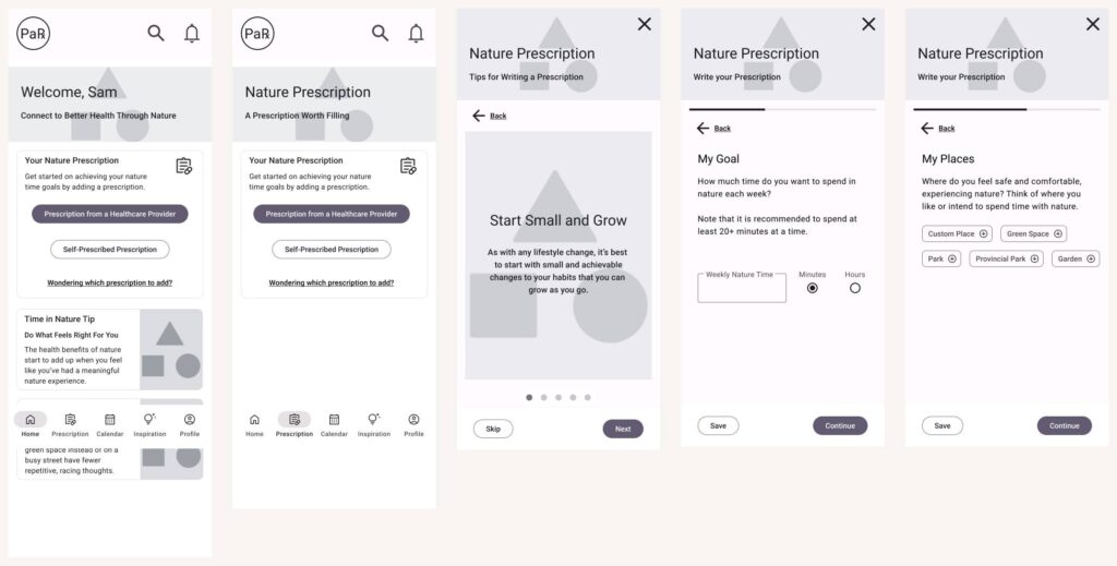
With my user flow mapped out, I started creating initial wireframes, focusing on the process, flow, and overall experience of a user creating a prescription on the app.
Usability Testing & Revamping the Lo-Fi Design
After building a lo-fi prototype, I conducted usability testing with five potential app users to evaluate the app and gather feedback. I then iterated on the lo-fi design to improve the user experience by focusing on the following learnings from testing: “show, don’t tell”, clearly differentiate prescription types, and offer suggestions to users.
Bringing the Design to Life
To build on my vision for the app, I developed a hi-fi prototype to communicate the overall aesthetic and user experience while integrating a PaRx brand redesign into the app.
Moving Forward with Next Steps
This was my first solo project and I didn’t develop as much of the app as I was expecting to in the 12 weeks, but I did prioritize a thorough process with an iterative approach.
Therefore, my next steps for this project would focus on the “Deliver” phase, including:
Reflecting on Lessons Learned
Reflecting on this project, I gained valuable insights that I intend to apply to my future work.

